Hi everyone!! I’ve an update, on what I’ve been up to - and I’m excited. It’s a rusty update 😉. As always, I would love to tell you a story (this will help set some context), but if you want to skip and go directly to the update, please scroll to: # THE Update section.
The Story
I’ve been through, possibly, the best and the worst time of my life. I use these contrasting words because everything went wrong - and that’s where you get an opportunity to shine. I think I fairly enjoyed resisting the pain and fighting through the odds, hopefully you’ll learn about it very soon on my blog (just need the courage to say it out loud :)).
Anyways, just when the life hit extreme low, I had two options:
- Cry about it, not for a day, but keep crying about it.
- Accept, and do something that I enjoy.
I chose a mix of both 1 and 2. Cried for a day or two, but then accepted and started diverting my energy to the things I imagined myself doing. One of those, which I can share here, was finishing up my dream side projects. To name a few:
- Completing the book: Writing Interpreter in Go.
- Do some leetcode to gain confidence.
- Release the next version of C++ File Manager.
- Write an App in Rust and more…
The 4th point you’re looking at, is exactly what we are going to cover today.
THE Update
Here it comes! For those who (very kindly) follow my YouTube channel, know already that I’ve been learning Rust for a while. And while I was at it, I found it a good time to start building something. Pop! OS, the best Linux distribution I’ve ever come across, announced their new Cosmic Desktop Environment a while back (it’s a work in progress). I like reading source codes, and have been following what they were doing with Cosmic and remembered that they were using Iced Library for the development (GUI). I thought to give it a try, and the best place to start with, was the YouTube Monitoring App which I was building earlier with Python and Electron JS. Porting the idea to Rust was comparatively easier than to think of another project.
Before I proceed, feel free to check out the repository here. It would be already outdated for this blog, but nonetheless - I hope you like the work.
So the journey took off, started with going through the examples, and the styling example. Seeing how theme is switched, was mesmerizing.
That’s where I started, taking the first steps, just replicating the styling example to see if I can reproduce and understand what they were doing. As the time passed by, things started to take a good look:
- Theme switching was enabled.
- Each user had a card (but not aligned 😢).
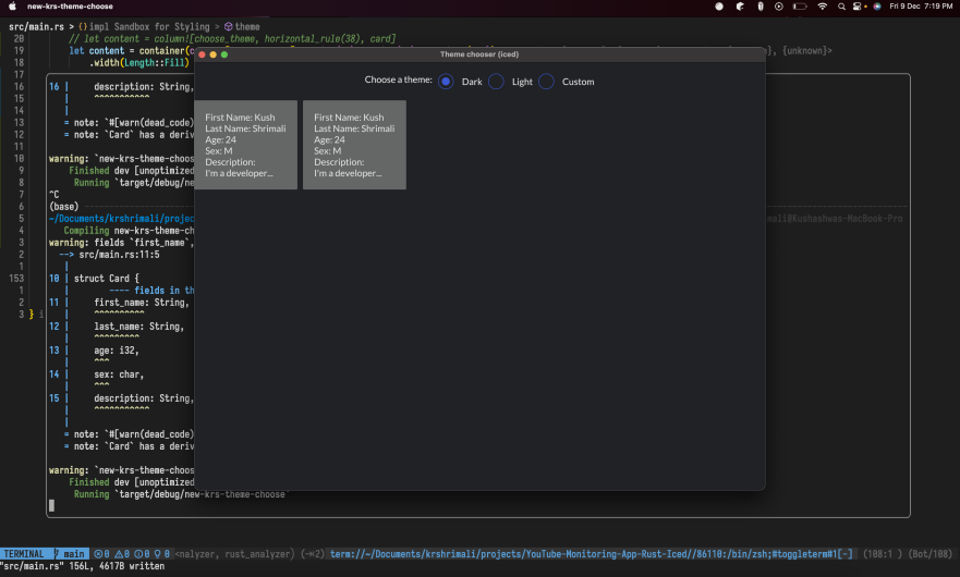
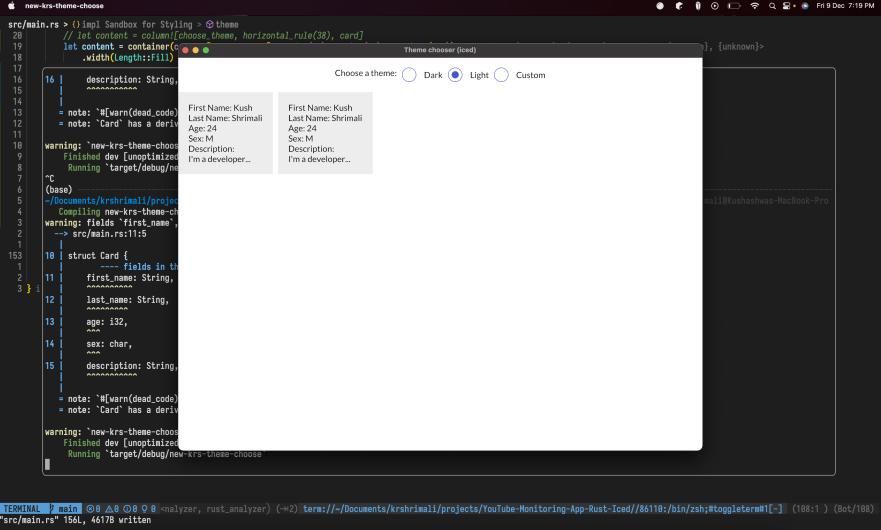
The ideal stage would be to see the YouTube API collect details, create the JSON file, and show it to the user. I knew I was not even close to the final goal, but why give up?
Anyways, my next target was to figure out having a grid - multiple rows and multiple columns. From what I know, there isn’t a grid like implementation within Iced, so I had to use Column and Row classes from Iced. It was tricky, if I have to be very honest, but finally worked out. Had to ask a couple of questions on the discord channel of Iced, they were very kind and quick to help me with my queries.
I also had to choose an image for each user, as an avatar was necessary. Once added, I knew it will start looking better. A header and a footer were also required, to give the user some info about what they are seeing on the screen. However, when the grid wasn’t full, the image wouldn’t align and that was an issue to resolve for the next stage.
Adding the avatar was very interesting, I wanted a link to work (for the avatar). But for now, I thought I’ll suffice to using an image path to see if it really works (spoiler: it did 😄):
fn profile_pic<'a>(width: u16) -> Container<'a, Message> {
    container(
        // This should go away once we unify resource loading on native
        // platforms
        if cfg!(target_arch = "wasm32") {
            image("profile_images/Noddy.jpeg")
        } else {
            image(format!(
                "{}/profile_images/Noddy.jpeg",
                env!("CARGO_MANIFEST_DIR")
            ))
        }
        .height(Length::Units(width))
        .width(Length::Units(width)),
    )
    .width(Length::Fill)
    .center_x()
}
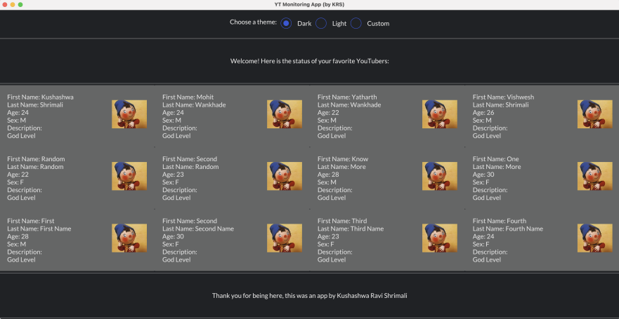
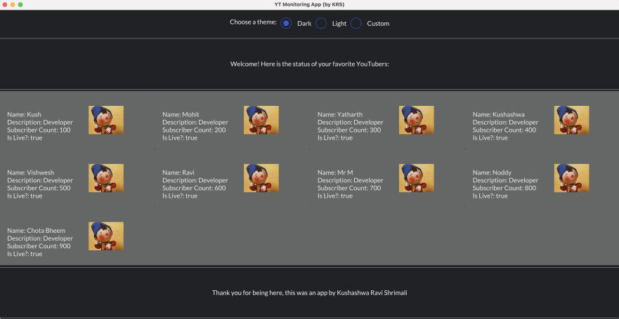
As I knew things were starting to take place, the next important step was to fix the alignment, and enable JSON parsing. Let me show you the issue we had with alignment:
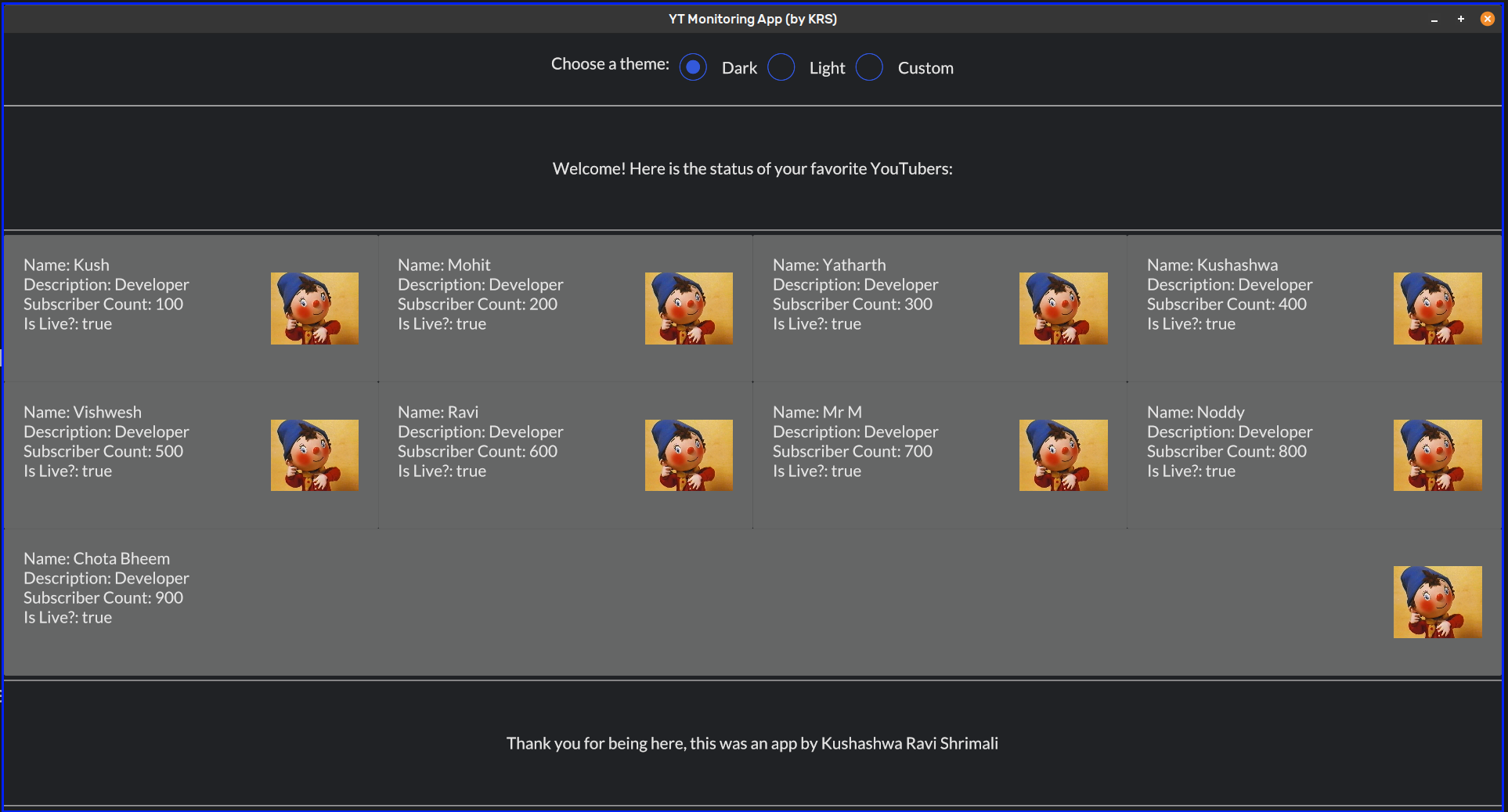
The alignment issue was fixed with using align_items and also avoiding width(Length::Fill) with the user cards. We’ll discuss these details in the next blog, for now, I just shared to give you a hint.
For JSON parsing, to start with, I created a sample JSON file, and used serde crate to parse JSON file. The way a JSON can be deserialized into a JSON class, was amazing to see - very intuitive.
pub fn read_json(file_path: &str) -> Result<YTCreator, Box<dyn Error>> {
    let file = File::open(file_path)?;
    let reader = BufReader::new(file);

    // Read the JSON contents of the file as an instance of `YTCreator`.
    let u: YTCreator = serde_json::from_reader(reader)?;
    if u.size() > MAX_EXPECTED_ITEMS {
        Ok(u.slice_to(MAX_EXPECTED_ITEMS))
    } else {
        Ok(u)
    }
}
The implementation of YTCreator had the fields that were useful for the user:
#[derive(Deserialize, Debug, Default, Clone)]
pub struct YTCreator {
    names: Vec<String>,
    avatar_links: Vec<String>,
    descriptions: Vec<String>,
    is_live_status: Vec<String>,
    subscribers: Vec<String>
}
If you have not noticed already, focus on the u.slice_to(MAX_EXPECTED_ITEMS) expression. While this isn’t really useful right now (more on this later), but it was a good practice to implement. This basically answers: “What if there is more data then the grid limit?”. Let’s say the JSON file contains the data for 13 users, but our grid could only have 12 users’ data -> in this case, .slice_to will make sure that we only use maximum of 12 users on the grid:
fn slice_to(&self, count_items: usize) -> YTCreator {
    let mut new_obj = YTCreator {
        names: Vec::new(),
        avatar_links: Vec::new(),
        descriptions: Vec::new(),
        is_live_status: Vec::new(),
        subscribers: Vec::new(),
    };
    new_obj.names = self.names.get(0..count_items).unwrap().to_vec();
    new_obj.avatar_links = self.avatar_links.get(0..count_items).unwrap().to_vec();
    new_obj.descriptions = self.descriptions.get(0..count_items).unwrap().to_vec();
    new_obj.is_live_status = self.is_live_status.get(0..count_items).unwrap().to_vec();
    new_obj.subscribers = self.subscribers.get(0..count_items).unwrap().to_vec();
    new_obj
}
The implementation of slice_to method is fairly simple, just creating another YTCreator object but with stripped count.
One of the very important step was to enable passing a link for the image/avatar. This was made possible using reqwest crate, getting the image in a form of bytes array and then converting it to an image::Handle.
fn profile_pic<'a>(width: u16, link: String) -> Container<'a, Message> {
    let img_obj = reqwest::blocking::get(link).ok();
    let img_bytes = match img_obj {
        Some(bytes) => {
            bytes.bytes().ok()
        },
        None => None
    }.unwrap();

    let out_img: image::Handle = image::Handle::from_memory(img_bytes.to_vec());

    container(
        image(out_img)
        .height(Length::Units(width))
        .width(Length::Units(width)),
    )
    .width(Length::Fill)
    .center_x()
}
While I was very happy that:
- The alignment was fixed
- Image links were working
- JSON parsing was done correctly
BUT there was a small but significantly major mistake I made. Let’s keep it for later though, keep reading ❤️
Starting from here, you’ll understand how important development is. In this stage, the UI won’t change BUT we’ll be significantly improving the performance.
So, while I was very happy about the project progress so far, I thought I’ll ask my friend to open it up on his system. He had Windows, but fortunately he also had WSL. Thanks to him, he didn’t give up on trying to run GUI on his WSL - and when finally the app loaded, it was LAGGING. 😢
I was surprised, because on my Mac - it was working fine. I opened up my Linux system, and guess what? It lagged there as well. I immediately knew I was doing something wrong. Now, as developers, we generally try to get to the bottleneck of the issue, and I had an instinct about it.
fn view(&self) -> iced::Element<'_, Self::Message> {
    let choose_theme = ...;

    let content = container(column![choose_theme].spacing(20).padding(20).max_width(600))
        .width(Length::Fill)
        .center_x();

    let footer = ...;
    let title_header = ...;

    let all_cards = render_cards::create_list_of_cards(&self.json_obj);
    let binding = render_cards::ListOfCards::default();
    // RELEVANT...
    let first_row = render_cards::create_row(all_cards.get(0).unwrap_or(&binding));
    let second_row = render_cards::create_row(all_cards.get(1).unwrap_or(&binding));
    let third_row = render_cards::create_row(all_cards.get(2).unwrap_or(&binding));

    container(column![
        content,
        horizontal_rule(10),
        title_header,
        horizontal_rule(10),
        first_row,
        second_row,
        third_row,
        horizontal_rule(10),
        footer,
        horizontal_rule(10),
    ])
    .height(Length::Shrink)
    .into()
}
The view method above was running every time I switched the theme (whenever anything changed), and this was the problem. Let me show you the create_row method, which will give you an idea why it’s slow:
pub fn create_row(cards: &ListOfCards) -> Row<'static, Message> {
    Row::with_children(
        cards
            .cards
            .iter()
            .map(|each_card| {
                container(
                    row![
                        column![create_card(each_card)].spacing(50).padding(20),
                        column![profile_pic(130, each_card.avatar_link.to_owned())]
                            .width(Length::Units(130))
                            .height(Length::Units(150))
                            .padding(20)
                    ]
                    .align_items(iced::Alignment::End)
                    .height(Length::Fill),
                )
                .width(Length::Fill)
                .center_y()
                .style(theme::Container::Box)
                .into()
            })
            .collect(),
    )
}
Just observe, that I was calling profile_pic method with the avatar link - which means that every time the theme is switched, the images will be fetched again. Wow! That’s the only bottleneck? Nope!
Surprise! There is one more, we were actually reading the JSON file in the view function as well. Which was bad! So we finally have 2 bottlenecks for the performance:
- Downloading avatar link to an image handle.
- Parsing and deserializing the JSON file to
YTCreatorstruct.
(Also thanks to the iced community on discord, who helped with the first point above. They were really helpful.)
Solving both bottlenecks above was intuitive to me. We could parse the JSON file as well as download the avatars when the app is created, for now. Later on, we’ll do it when the user has changed inputs for the YT users they want to monitor. Here is how I solved it:
fn new() -> YTMonitor {
    let json_obj = render_cards::get_json_data();
    let image_handles = render_cards::get_all_avatars(&json_obj);
    // Because dark as default is cool :D
    YTMonitor {
        theme: Theme::Dark,
        json_obj,
        loaded_photos: image_handles,
    }
}
As you can see above^, we have json_obj, loaded_photos as two added fields to the YTMonitor struct. We parsed the JSON file as well as downloaded all the avatars (we already know the avatar links from the JSON file). Later on, I would just use these as self.json_obj and self.image_handles in the view function, so no more performance degradation!
fn view(&self) -> iced::Element<'_, Self::Message> {
    // ...
    let all_cards = render_cards::create_list_of_cards(&self.json_obj);
    let binding = render_cards::ListOfCards::default();
    let all_photos = self.loaded_photos.to_owned();

    let first_row =
        render_cards::create_row(all_cards.get(0).unwrap_or(&binding), &all_photos, 0);
    let second_row =
        render_cards::create_row(all_cards.get(1).unwrap_or(&binding), &all_photos, 4);
    let third_row =
        render_cards::create_row(all_cards.get(2).unwrap_or(&binding), &all_photos, 8);
}
As you can see above, I am passing the all_photos variable to create_row this time (along with the offset). The profile_pic method just takes the image handle now:
pub fn profile_pic<'a>(width: u16, img_handle: image::Handle) -> Container<'a, Message> {
    container(
        image(img_handle)
            .height(Length::Units(width))
            .width(Length::Units(width)),
    )
    .width(Length::Fill)
    .center_x()
}
^^ This makes it much faster now! And yes, it did solve the problem. While doing this, of course, I learnt a lot of Rust, and Iced. So many things to learn, and I’m already enjoying the challenges.
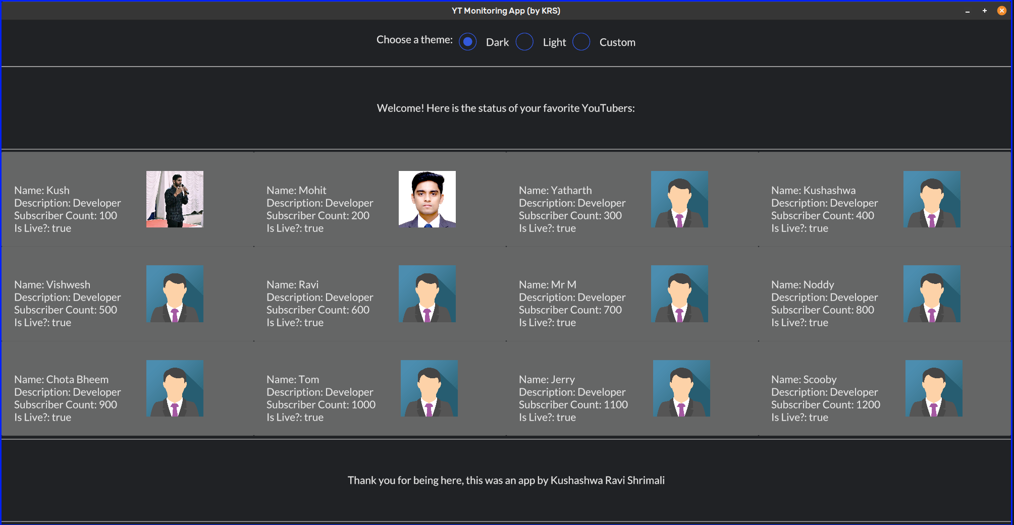
I know this doesn’t look the best yet, there are so many good apps out there built on the top of Iced, but I’m getting started. Once this is done, I know at least - I - would love it. ❤️
Here is how the app looks like, right now (featuring my friend Mohit Wankhade 😃):
We aren’t done yet by the way, I have to cover some macros I built, but I’ll keep it for my next blog. Until then, I hope you continue grinding whatever you love, and make the best out of the time you have. Take care, and thank you for being here. 💗